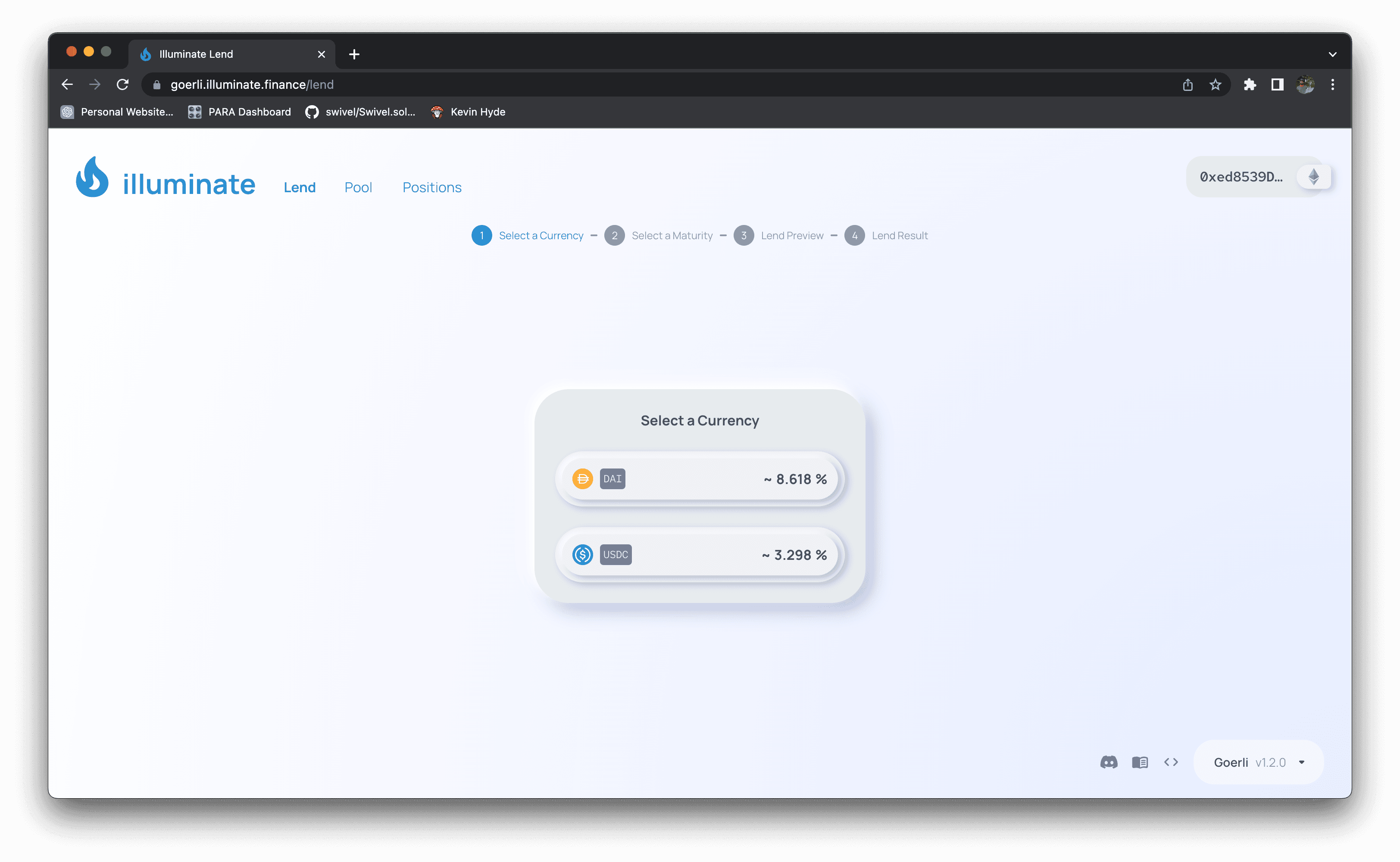
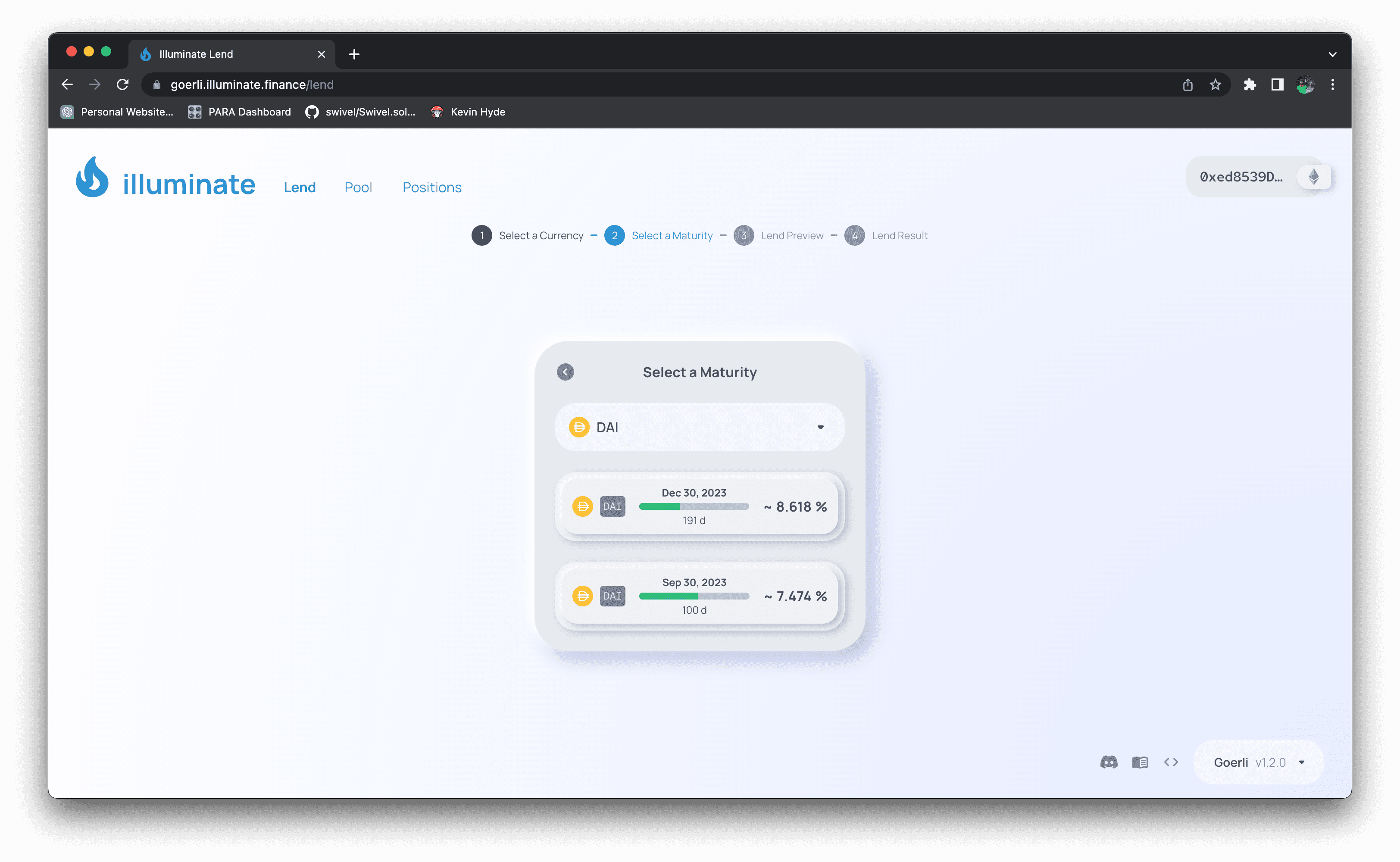
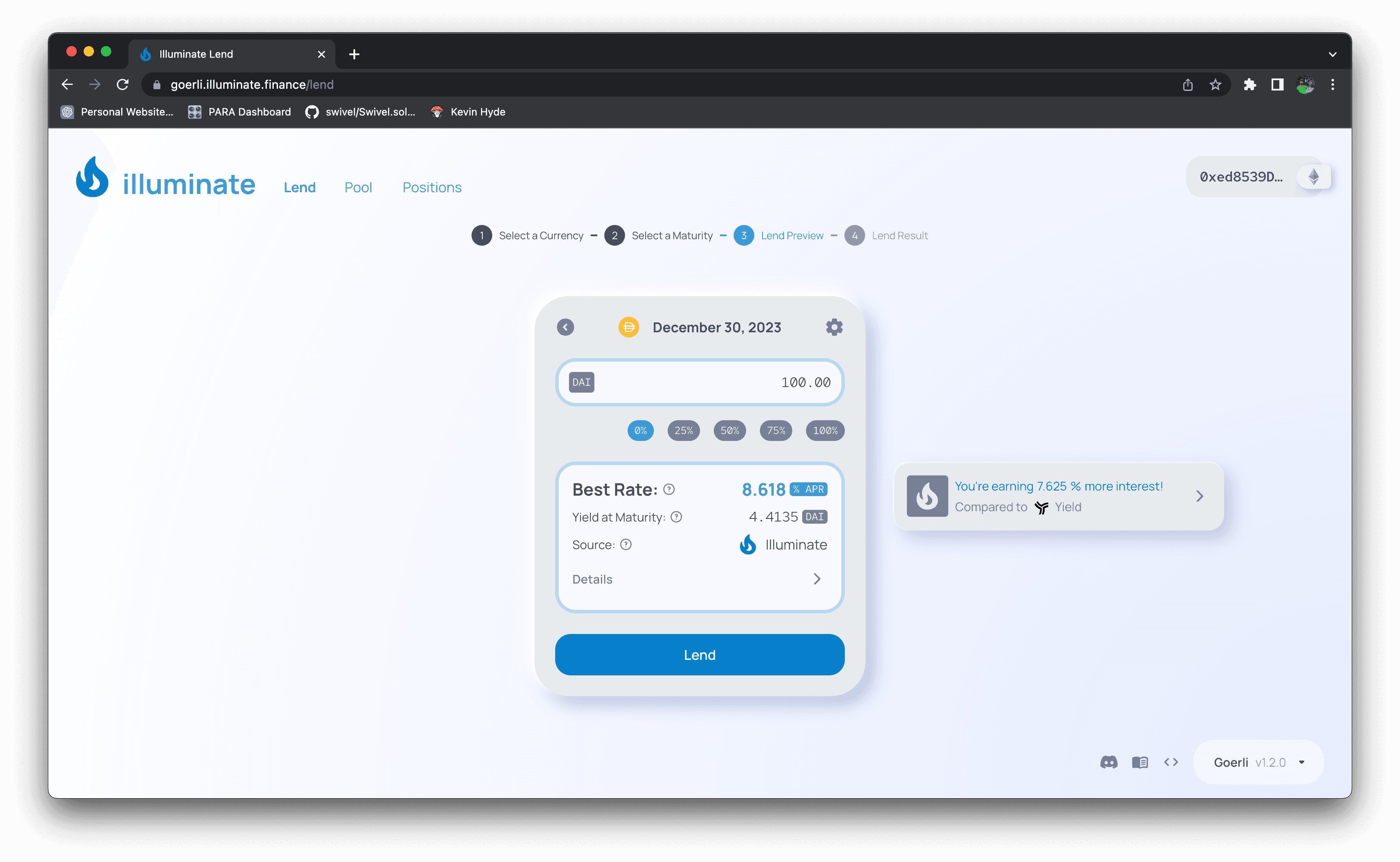
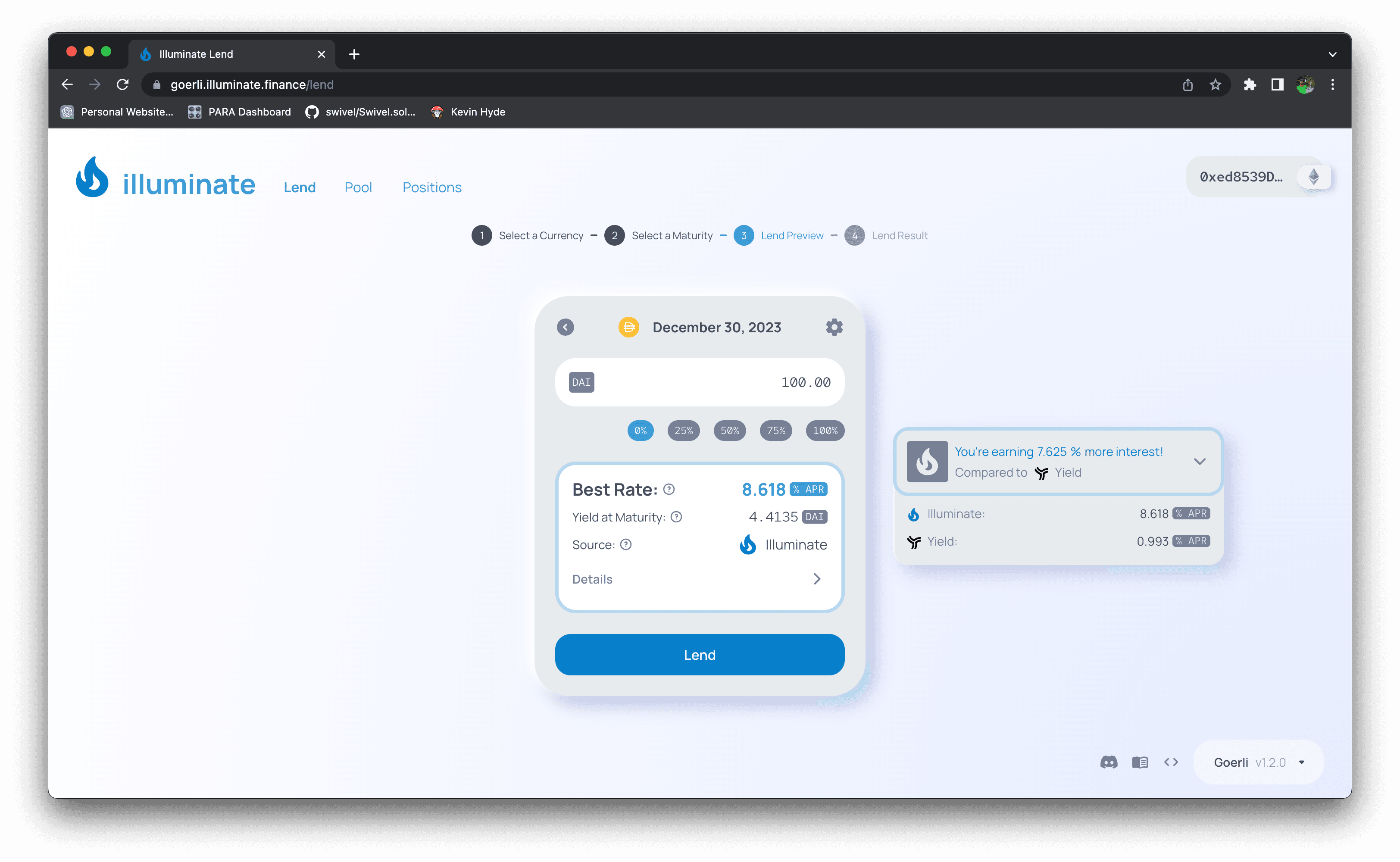
Transaction UI on Illuminate

The Situation
While seasoned DeFi users might well understand the progression of financial derivatives Illuminate relies upon, retail users can be quickly confused by the complex derivative contracts that make up the Illuminate protocol. And even well versed traders benefit from a succinct and clear interface with just enough details to accurately represent transactions.
The Solution
Through a series of design iterations based upon competitor analysis, test-user input, and coinciding development of the product's domain language, we were able to distill the complexity of the transactions into a simple, intuitive interface that allows users to lend without having to confront the complexity of the underlying derivative contracts.
I progressed our UI designs towards interactive prototypes of high-fidelity designs and staged numerous demos and user interviews with members of our Discord community, investor partners, and other DeFi users. Gathering feedback and iterating on the designs, I worked closely with our front-end lead dev to ensure the designs were feasible and scalable.
The Result
Our live product has been received well, with numerous users commenting on the simplicity of the UI and the ease of use, not too mention good lookin' 😘. We have a long way to go, but we're off to a great start.
Why I Bring It Up
I saw our design process for a brand new product from the core idea - expressed in Solidity code and financial derivative theses - to a fully operable UI. Because of my knowledge and experience in Front End Web development, I was able to keep the design spec within realistic bounds so that moving them to code production was a smooth process. And because my FE dev counterpart is an absolute pro, we continued to uncover and address emergent UX and design issues as we built out the product.


